I’ve always been particularly interested in package design and it's something I would want to get more experience in. At Metropolia UAS, I took a course led by award-winning art director and graphic designer Päivi Helander. We explored different materials and learned how to make efficient and sustainable choices throughout the packaging design process. For the final assignment, we were asked to design packaging for three lip balm flavours. We were provided with the required text, symbols, templates, and logo – but everything else was left to our own imagination.
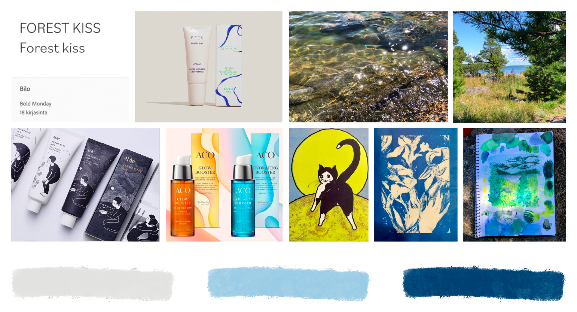
Moodboard
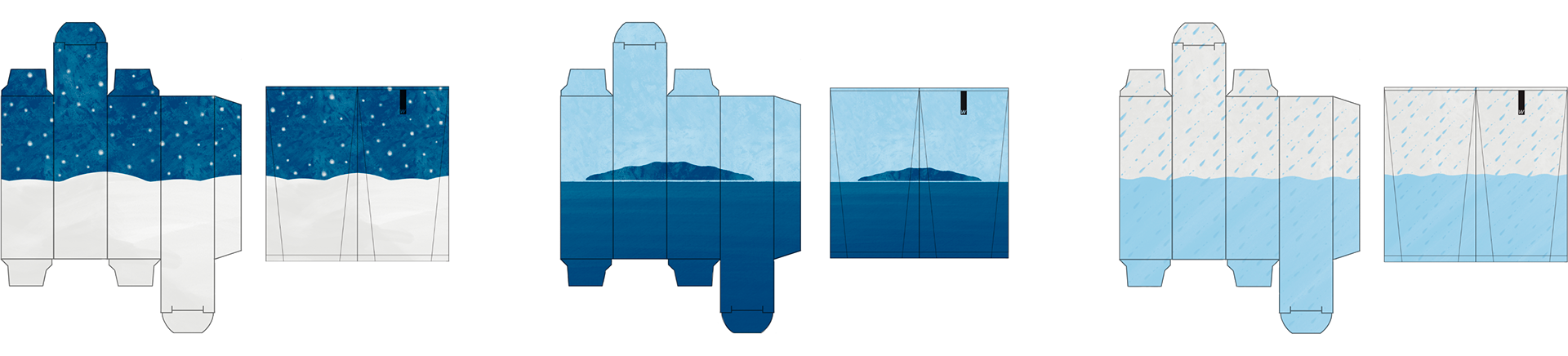
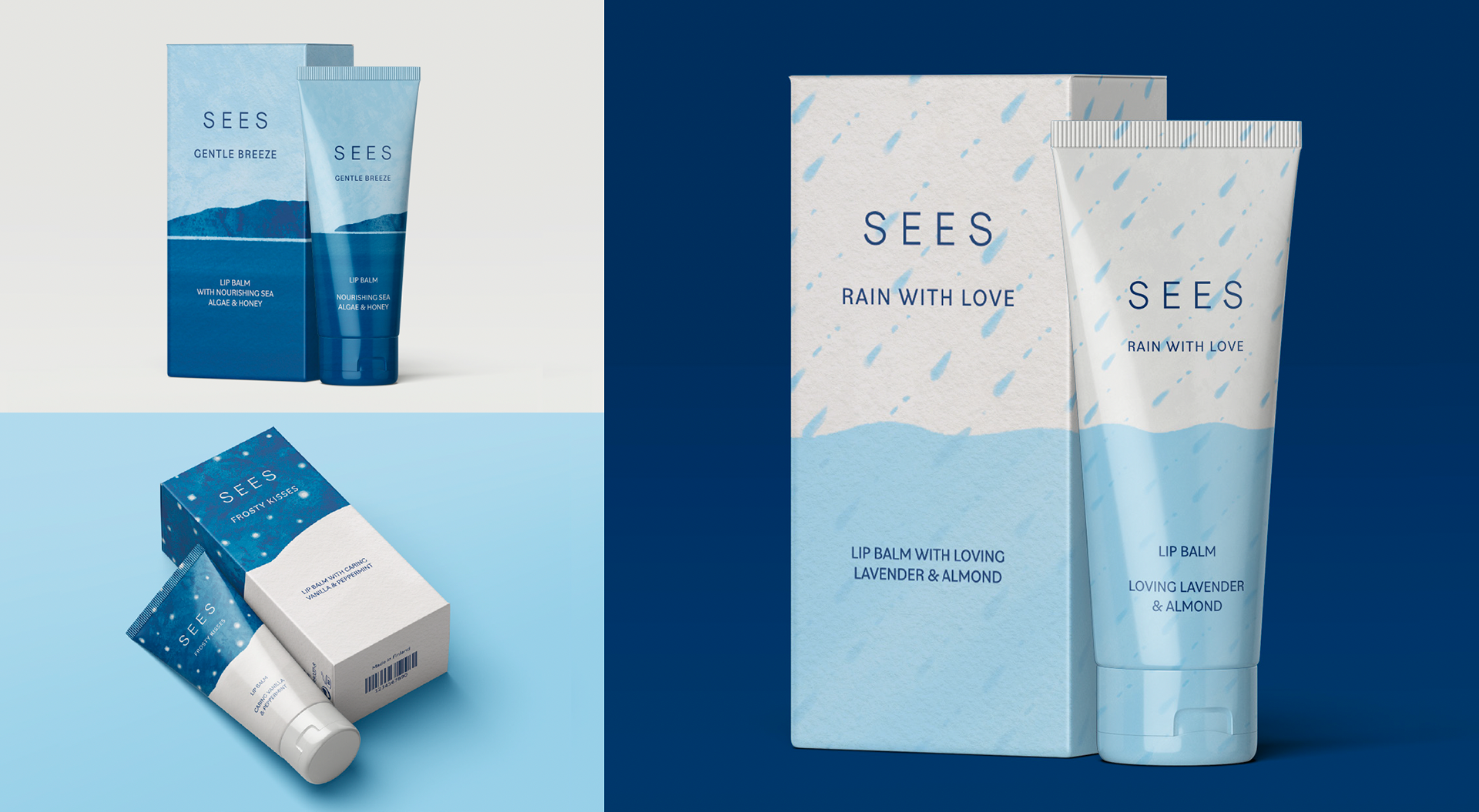
It was important to me that the flavours clearly belonged in the same visual family so I concentrated on spreading the same elements throughout all the designs. These elements included using the three established colours I had chosen in rotation and similar composition. As a connecting theme I chose bodies of water: snow, rain and the ocean. I made the illustrations with Procreate and the layout with Indesign. I took inspiration from my favourite postcards and pictures from my family cottage. I went for a painterly feel with the illustration style.
Mockups
For the outer packaging, I selected a stiff matte carton to convey a sense of sustainability and quality. For the tube I chose recycled plastic PCR (Post consumer Resin). I chose this because, lip balms are usually at the bottom of the bag so this material would be the most durable for the tubes long lasting performance. I loosely referenced the original Sees lip balm packaging as inspiration as well as ACOs serum bottles. I was drawn to ACOs booster serum series bright colour palette, and since their products are positioned in the same mid-range price category I envisioned for my design, they were a natural source of inspiration.